Rethinking HMI Touch Panels
For Horton Emergency Vehicles, I redesigned front and rear touchscreen control panels to create a more user-friendly and visually appealing interface. The project began with comprehensive user research, where my team and I traveled to meet with users of the existing system. We conducted surveys and interviews to identify pain points and uncover opportunities for improvement.
Horton Emergency Vehicles
-
Horton Vehicle HMI Panel Design
Role: User Research, UX/UI Design
Architecture and Wireframes
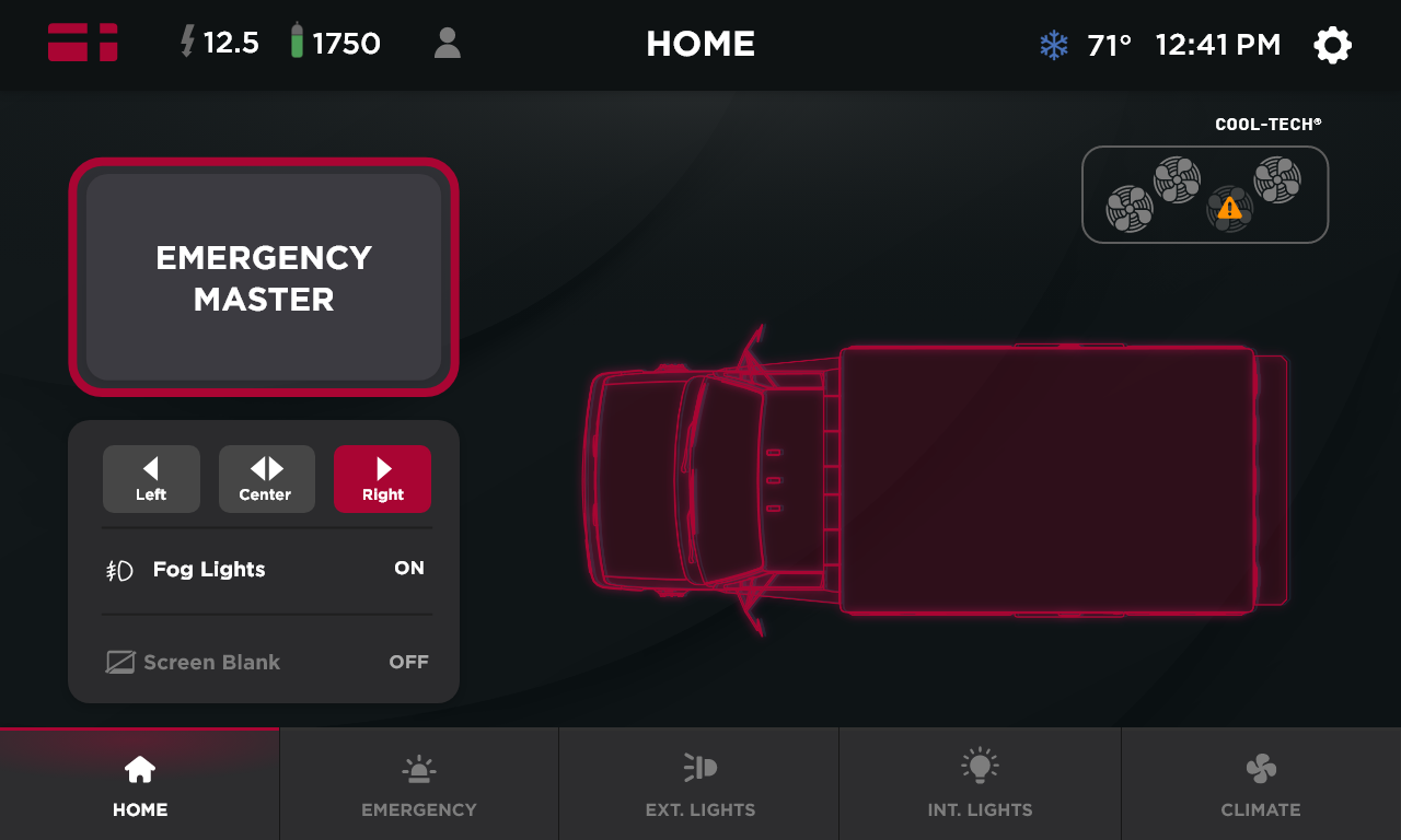
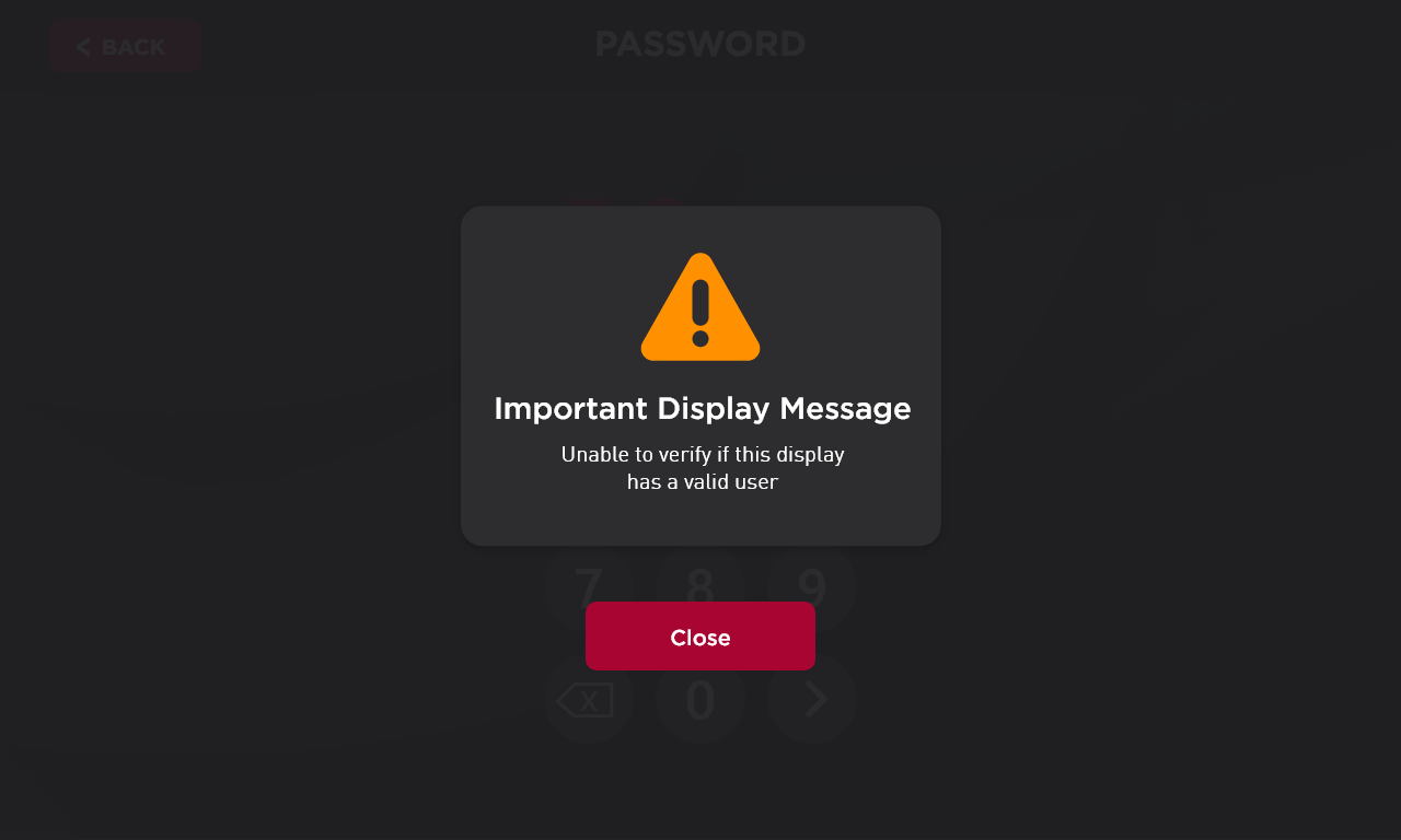
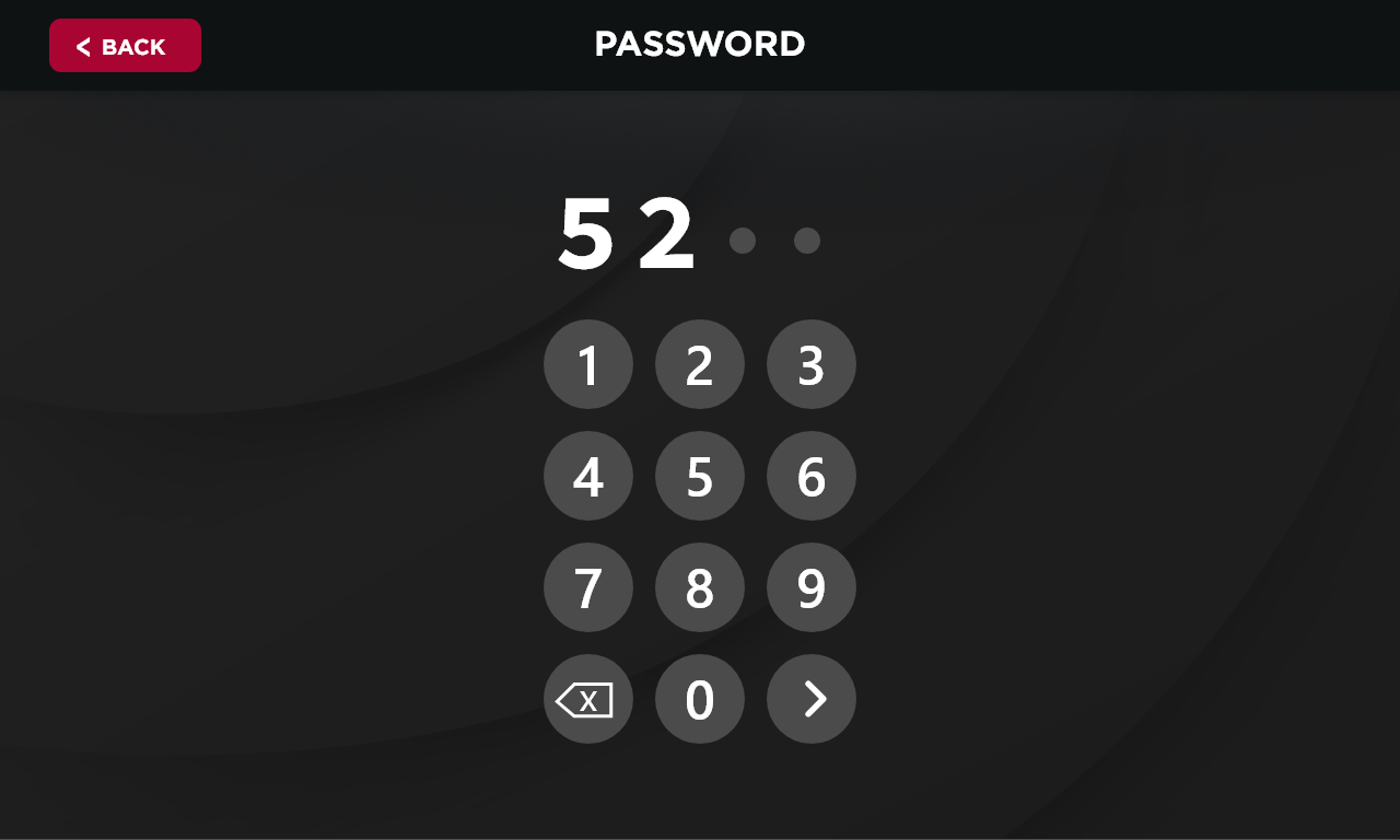
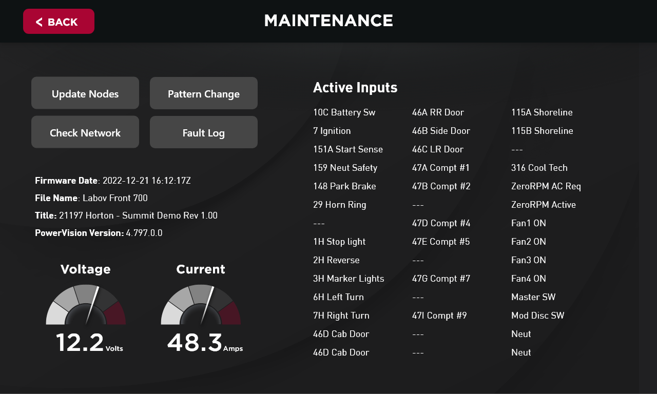
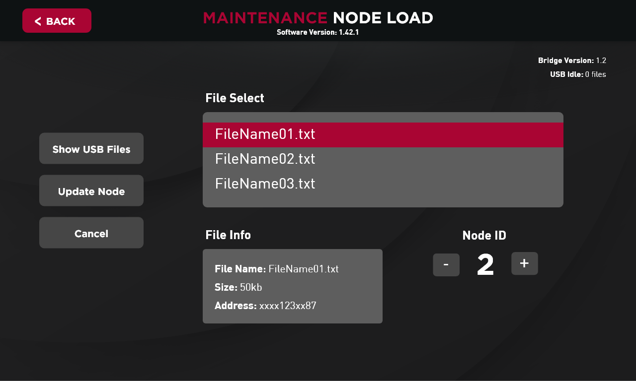
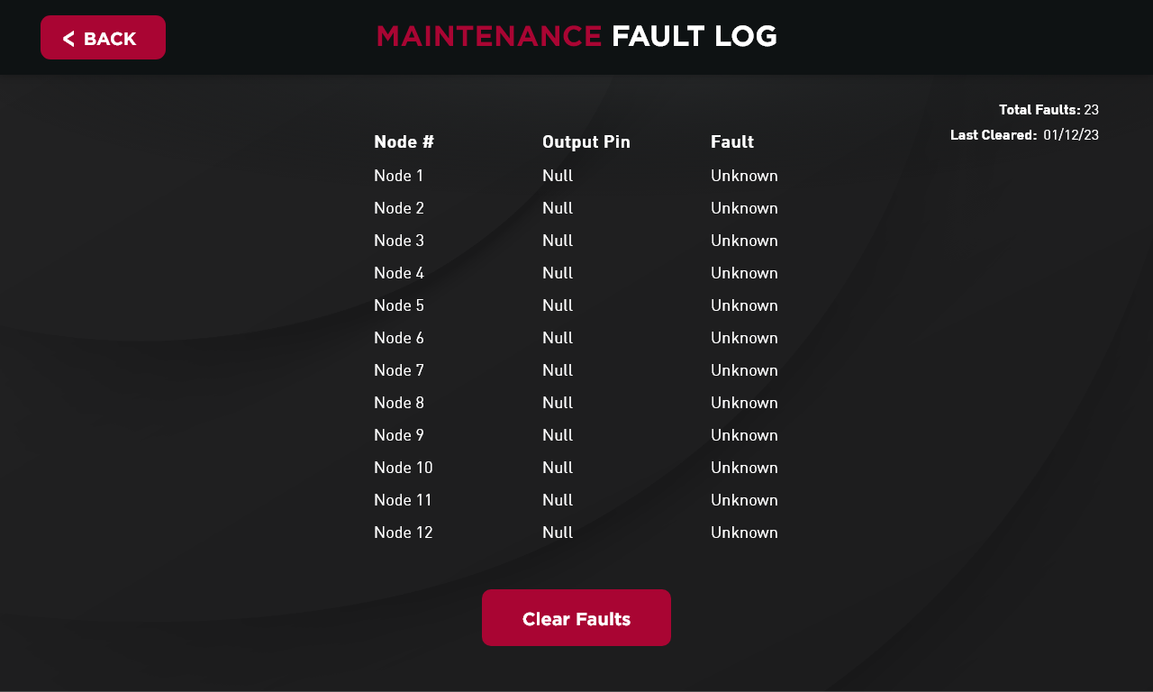
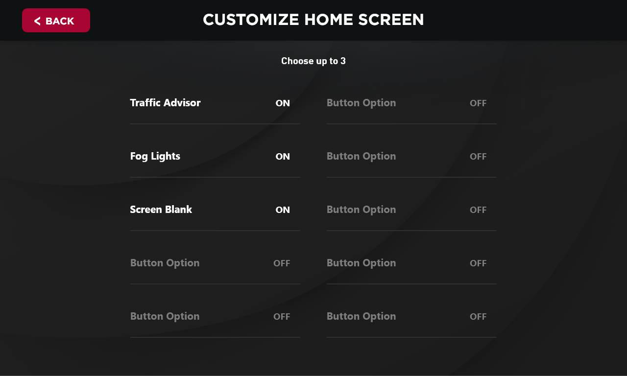
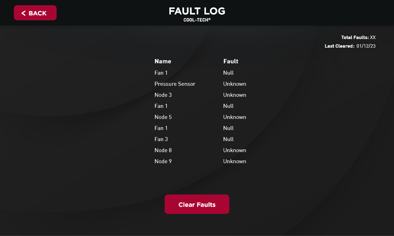
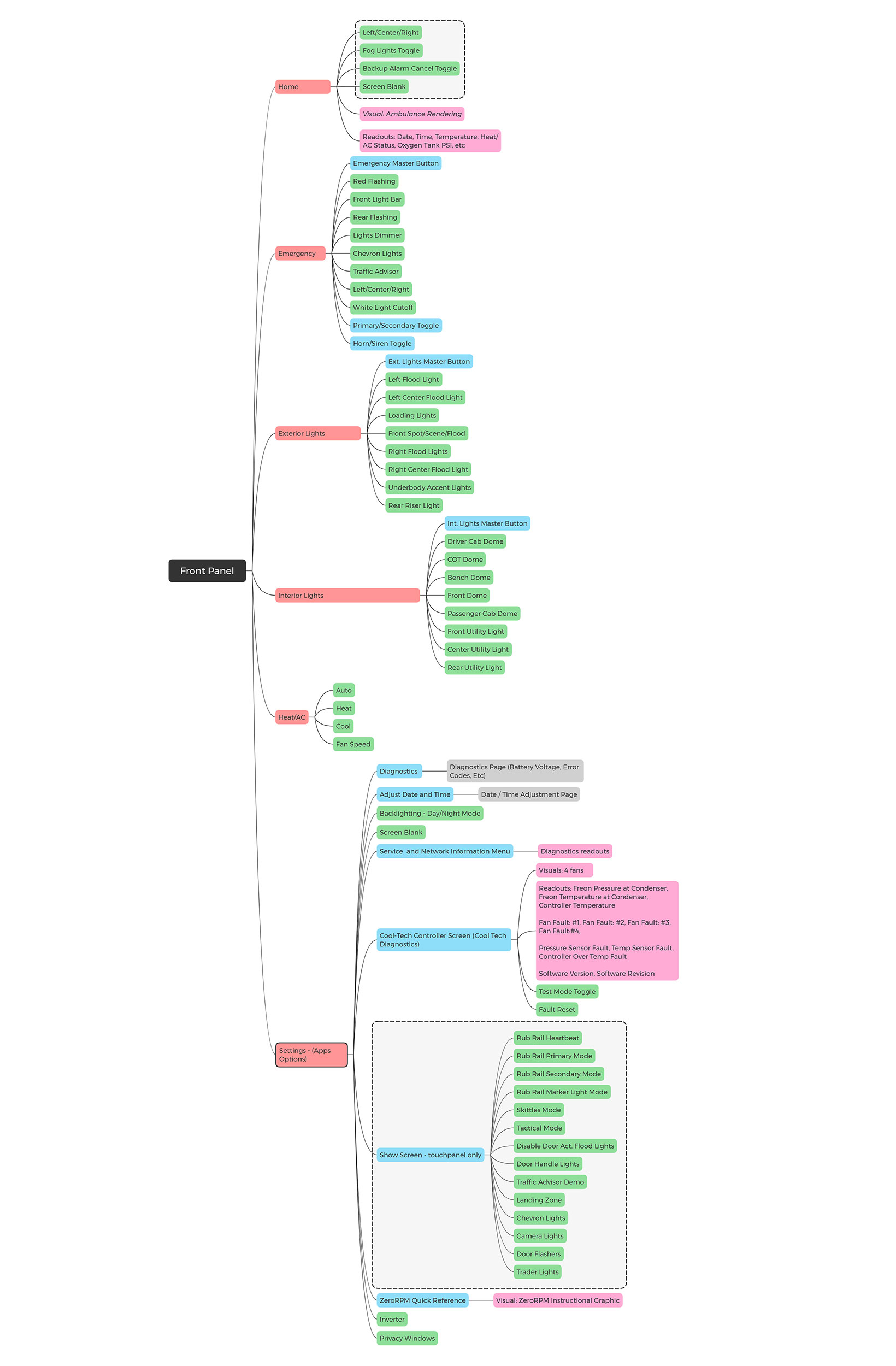
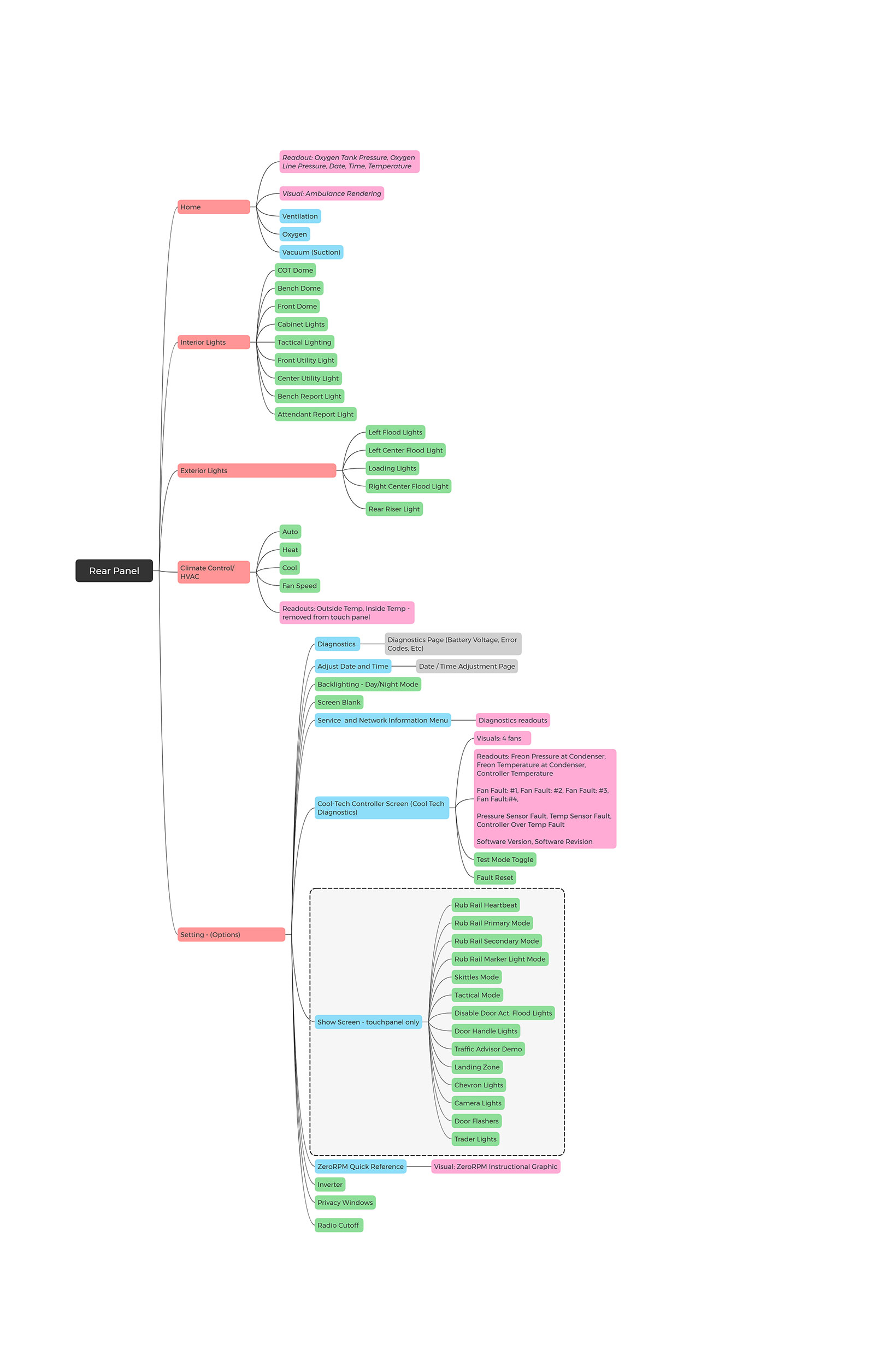
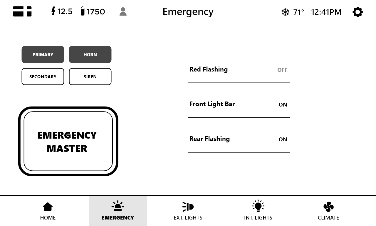
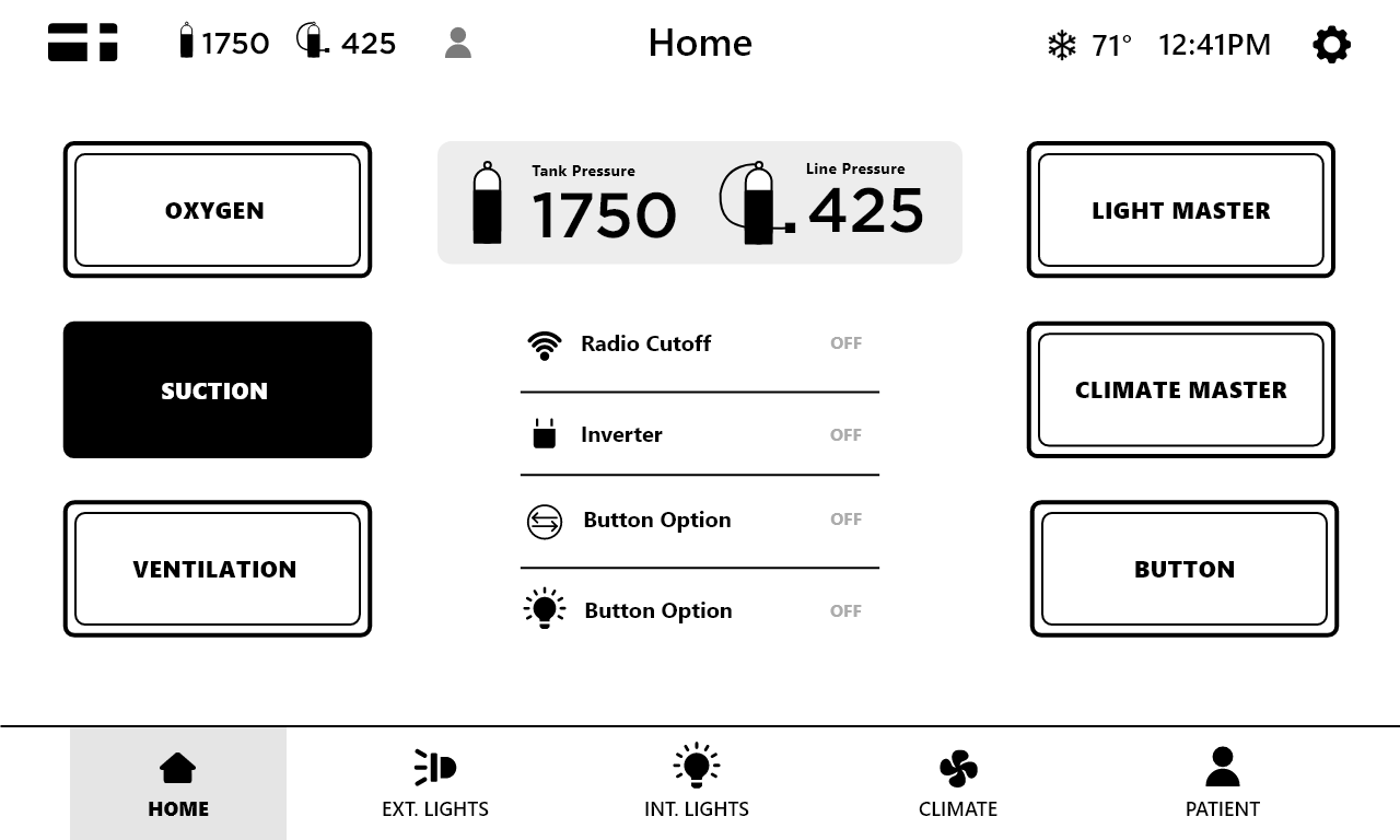
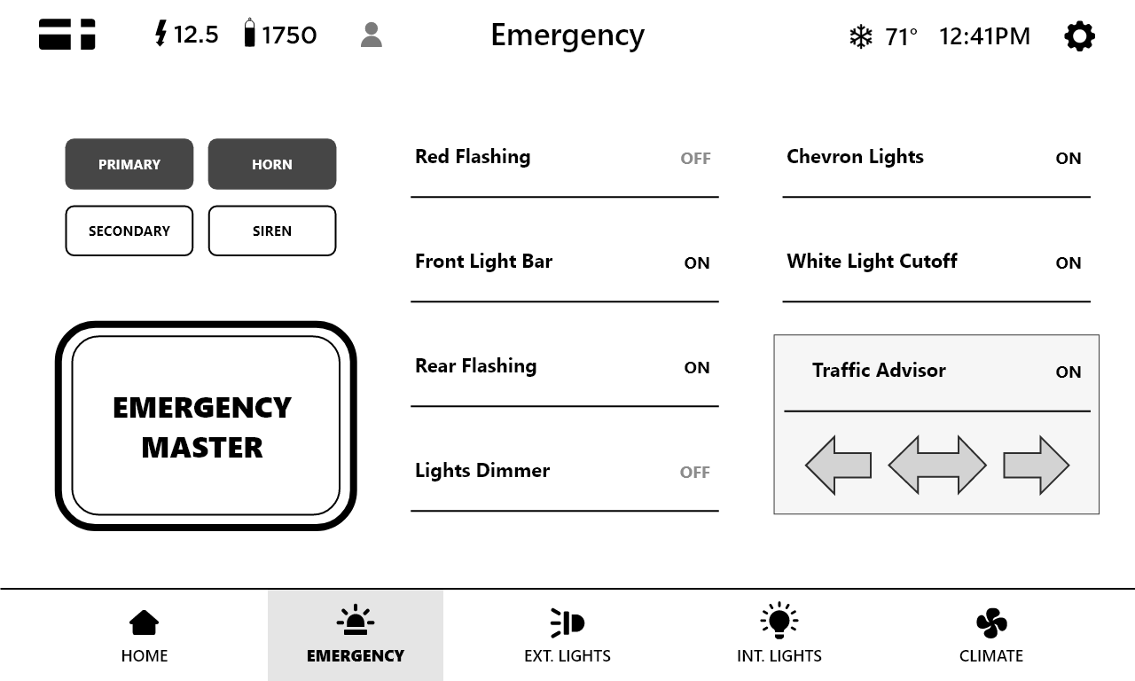
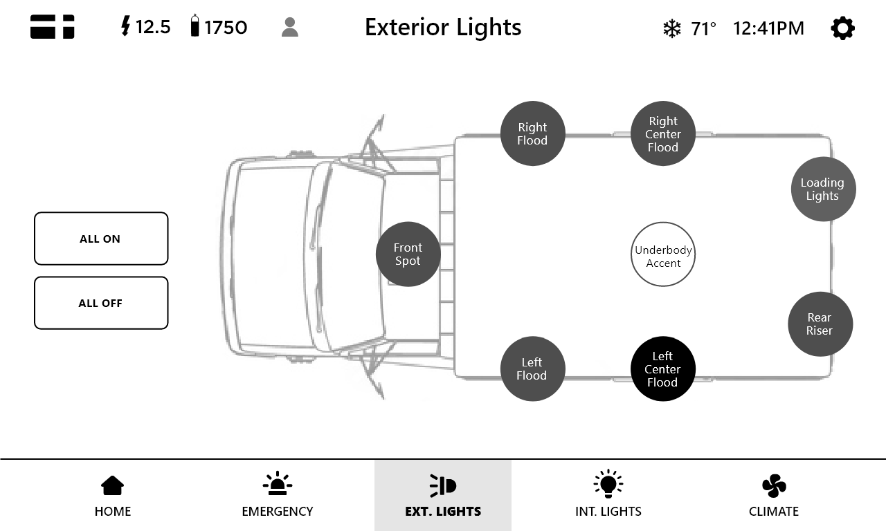
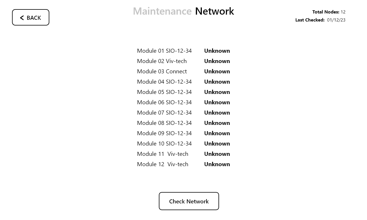
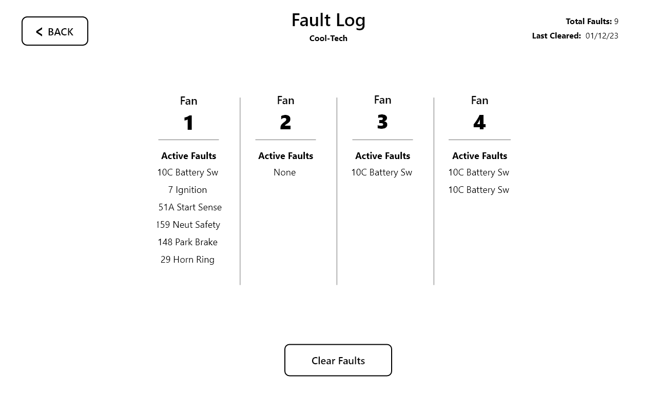
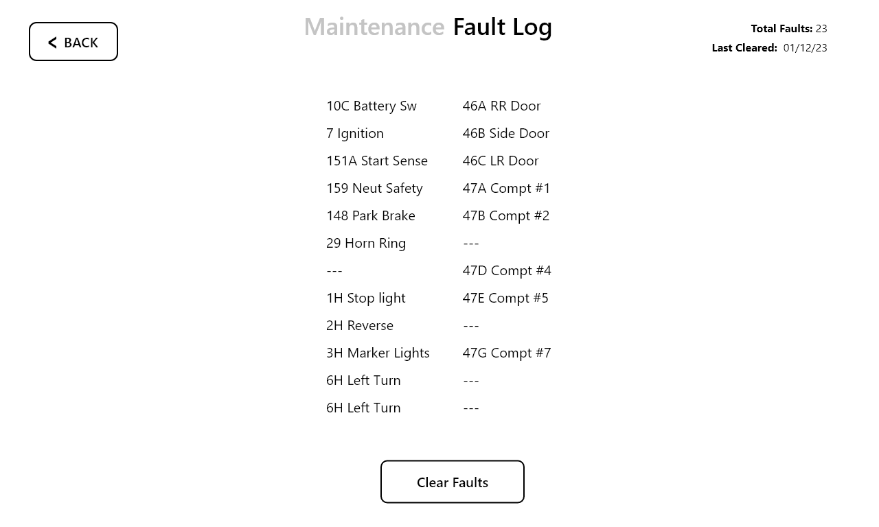
As part of the UX process, I analyzed and updated the user flow to improve efficiency and usability. I identified and eliminated several dead-end pathways, ensuring a smoother, more intuitive experience for users. Additionally, I streamlined access to the most important features, reducing unnecessary steps and simplifying interactions.
As part of the UX process, I analyzed and updated the user flow to improve efficiency and usability. I identified and eliminated several dead-end pathways, ensuring a smoother, more intuitive experience for users. Additionally, I streamlined access to the most important features, reducing unnecessary steps and simplifying interactions.
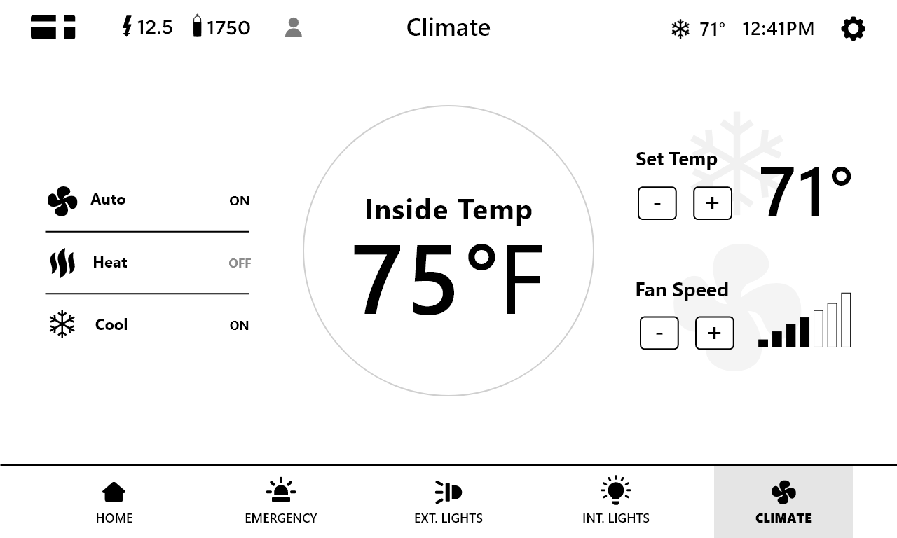
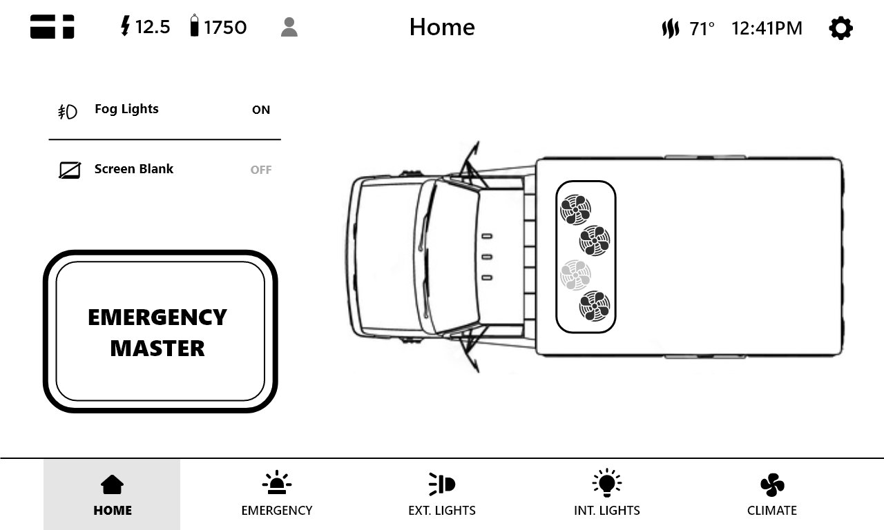
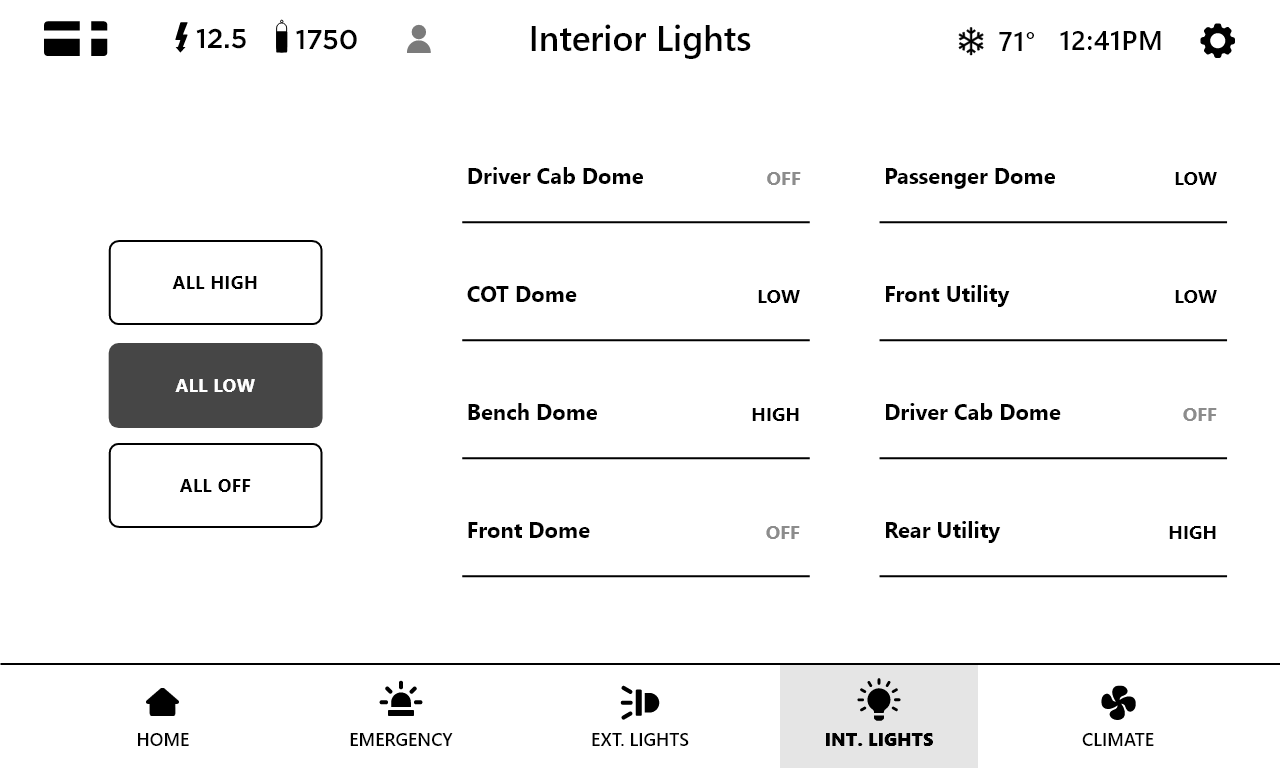
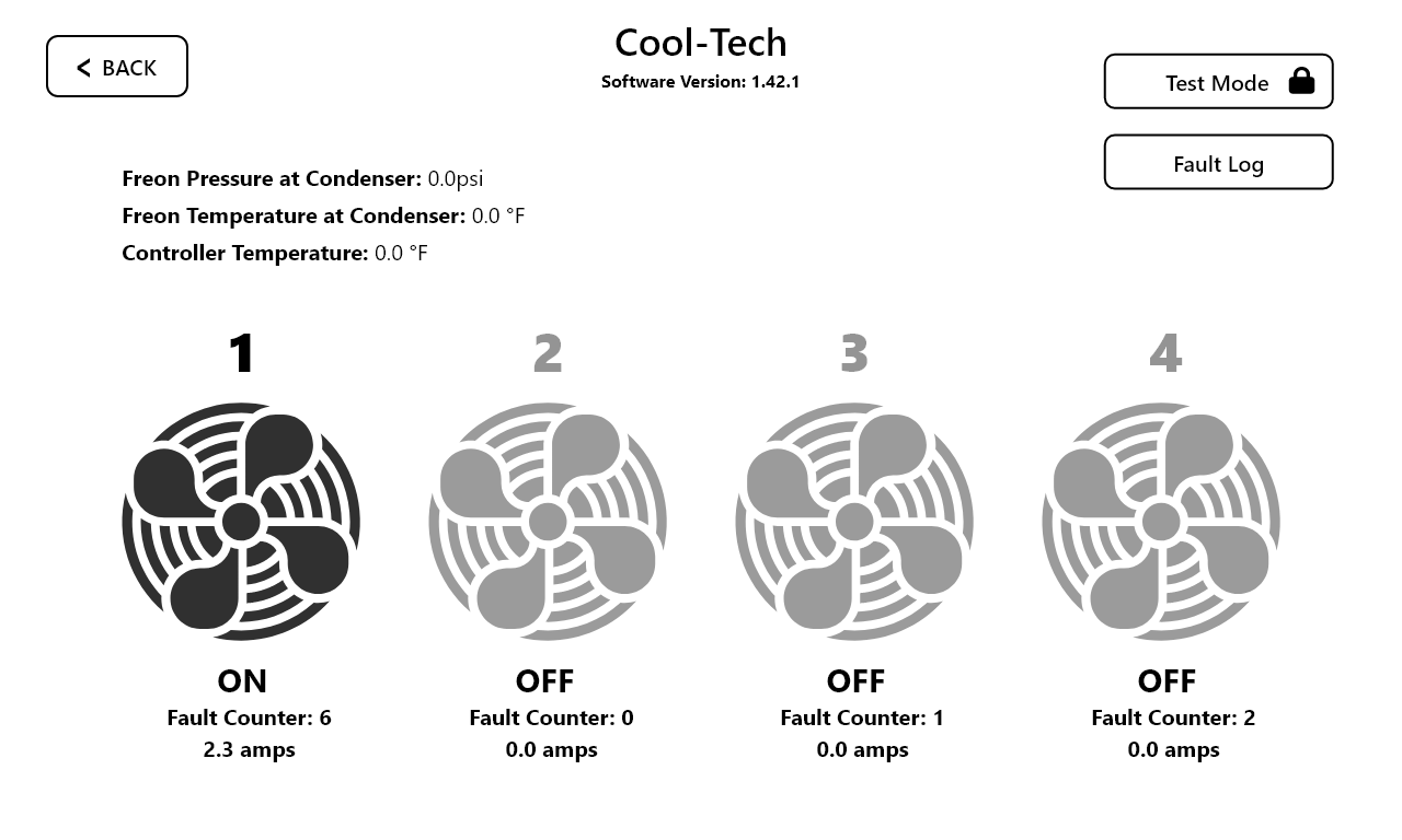
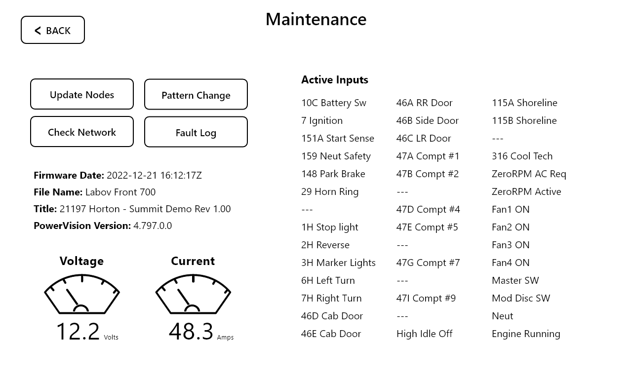
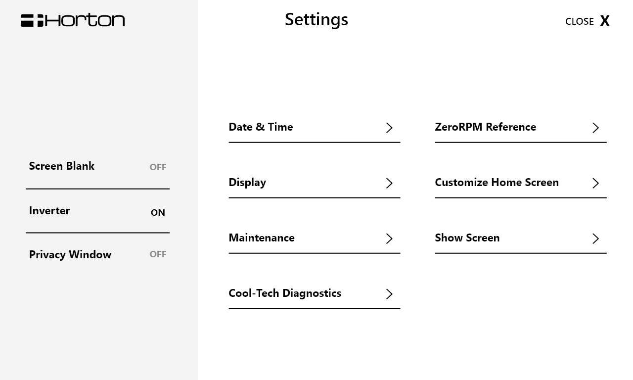
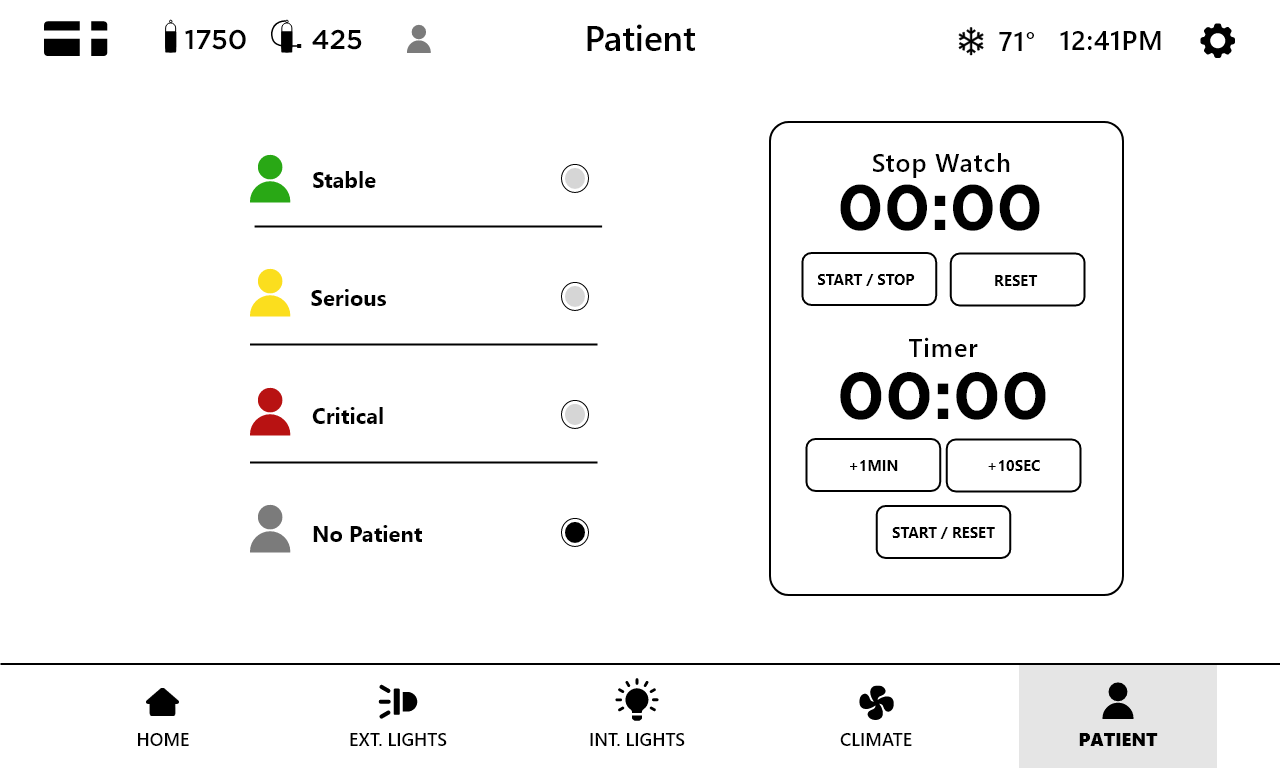
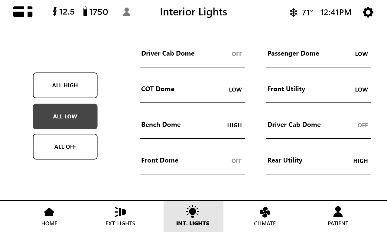
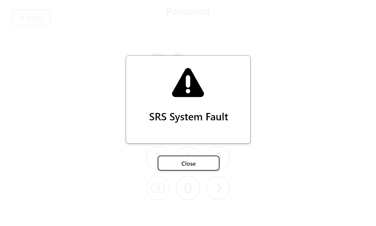
Designing the Mood Board & High-Fidelity UI
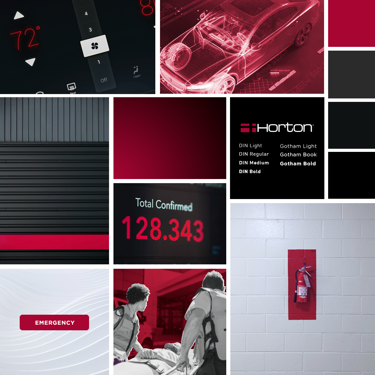
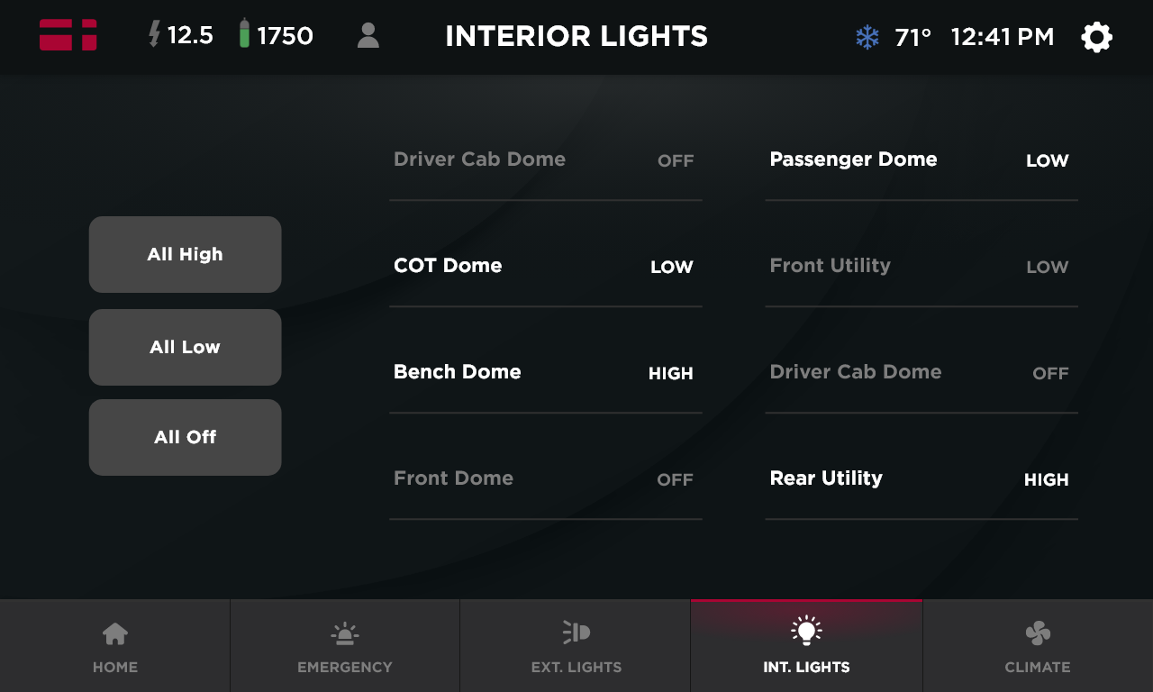
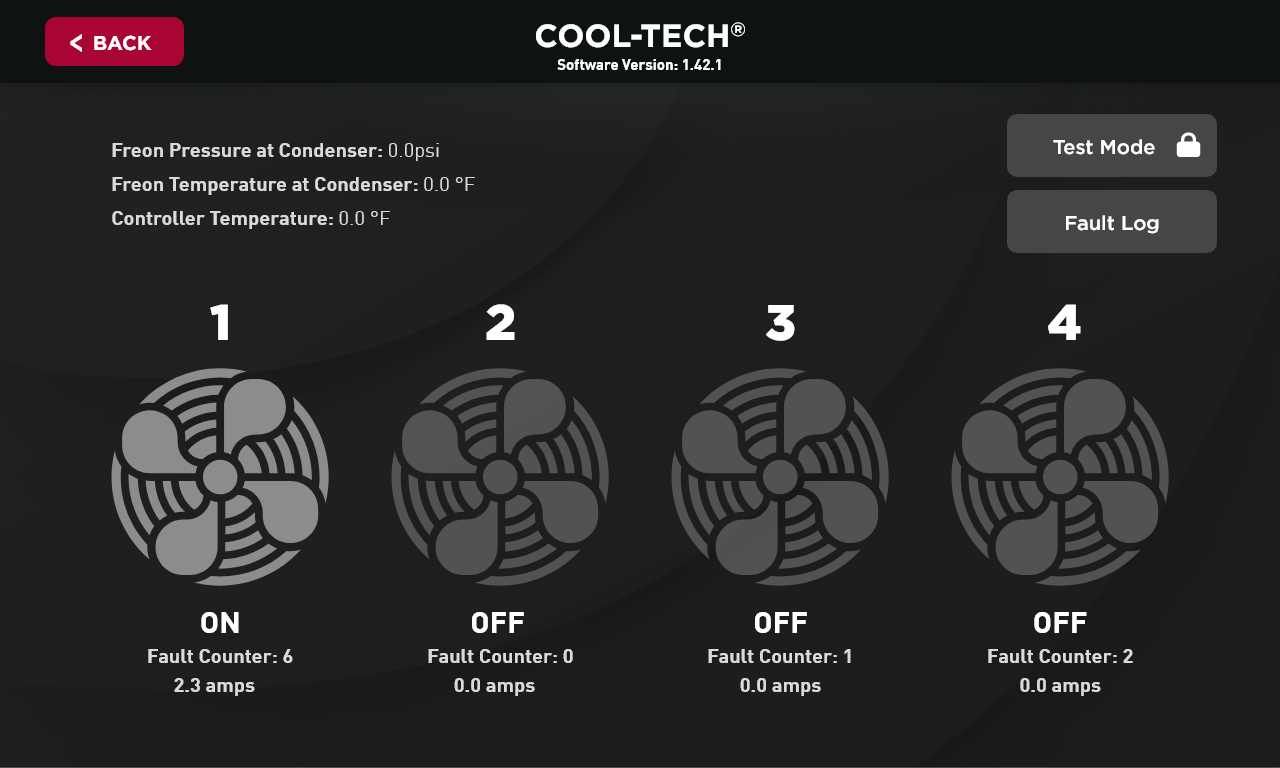
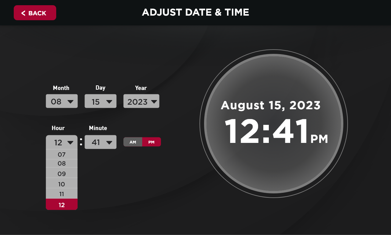
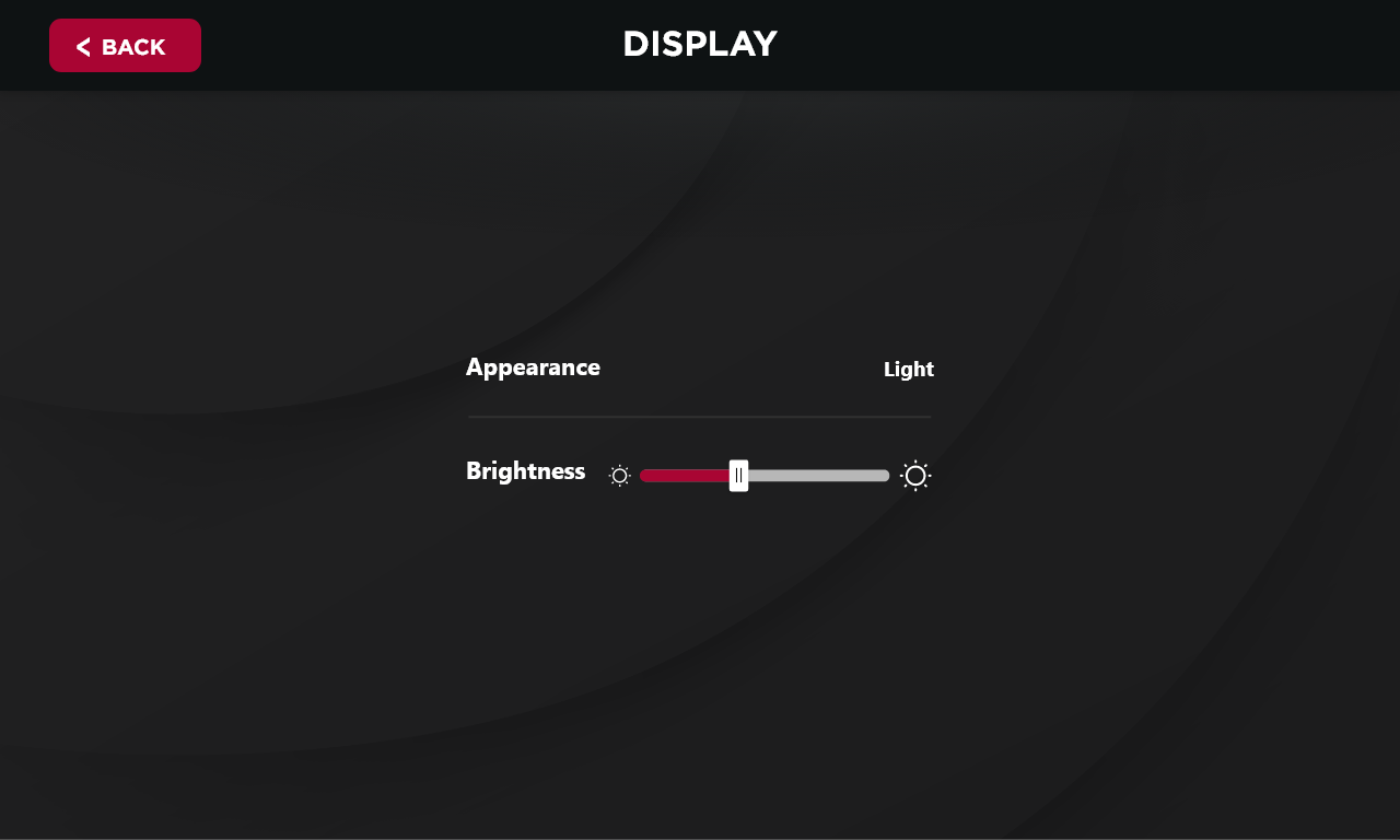
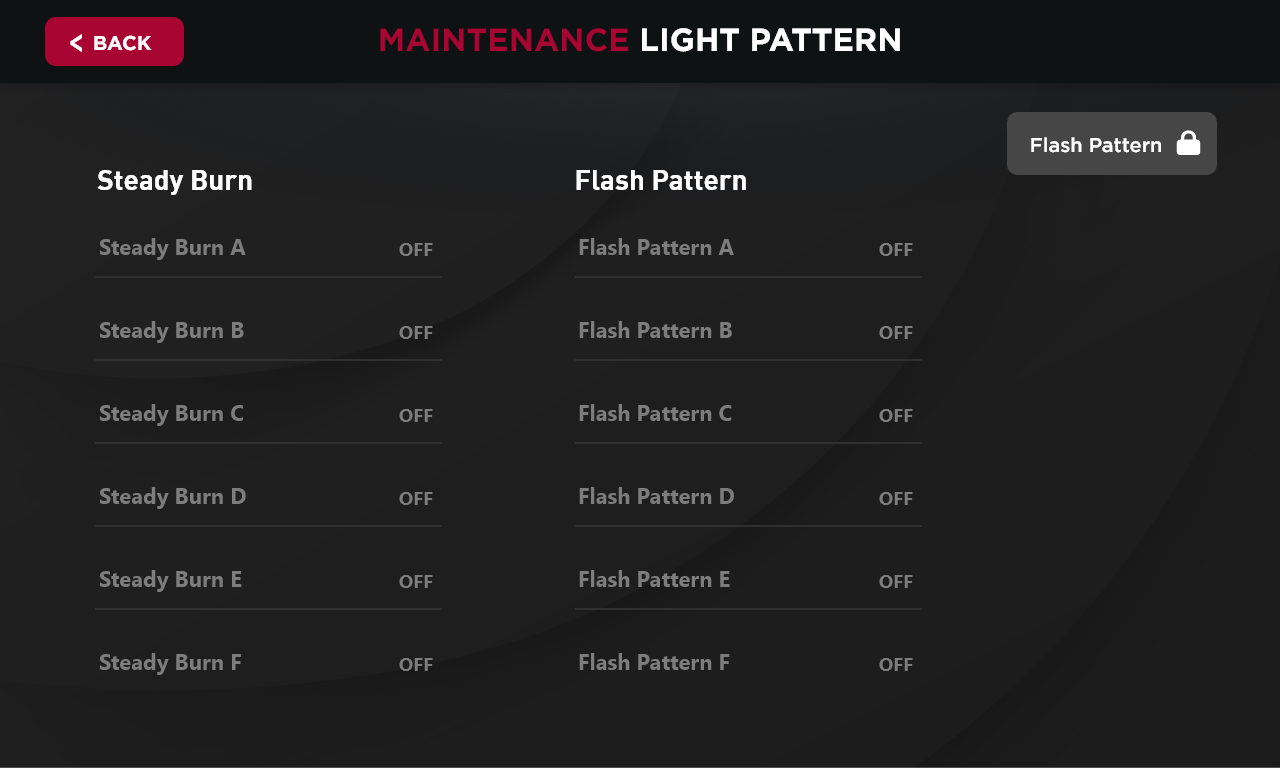
To establish a cohesive visual direction, I created a detailed mood board that captured the desired aesthetic, including color palettes, typography, iconography, and visual patterns. The client wanted a modern yet approachable design, so I selected clean, professional elements that enhanced usability while maintaining a polished look.
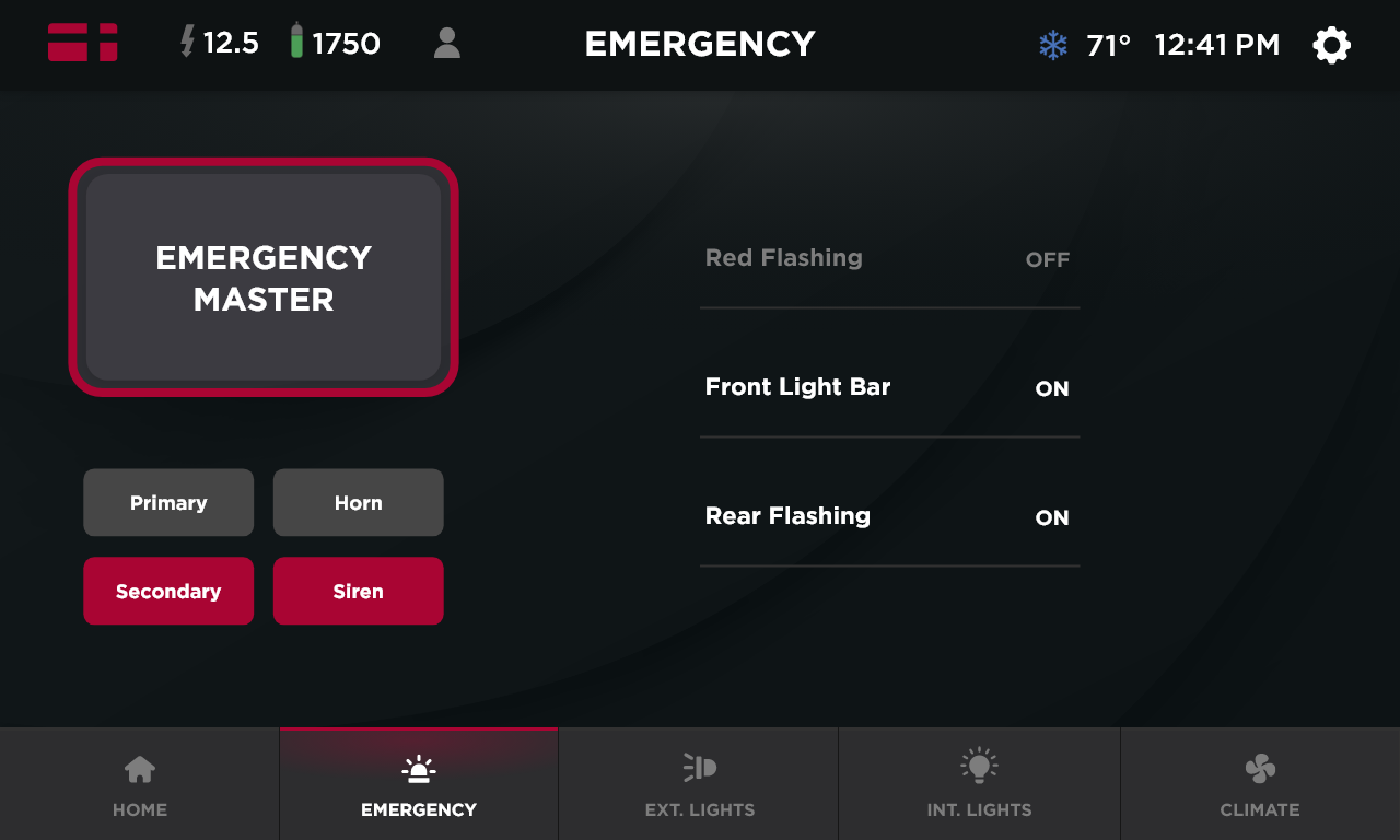
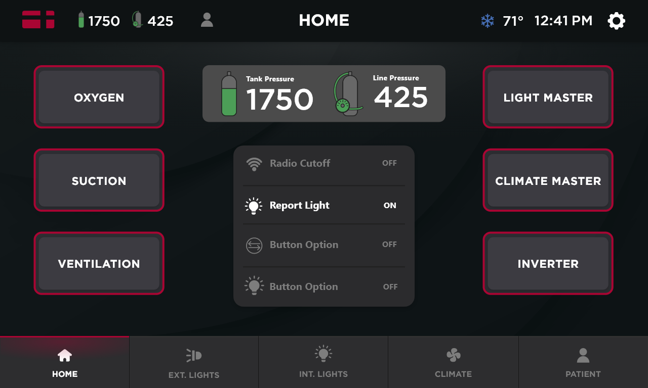
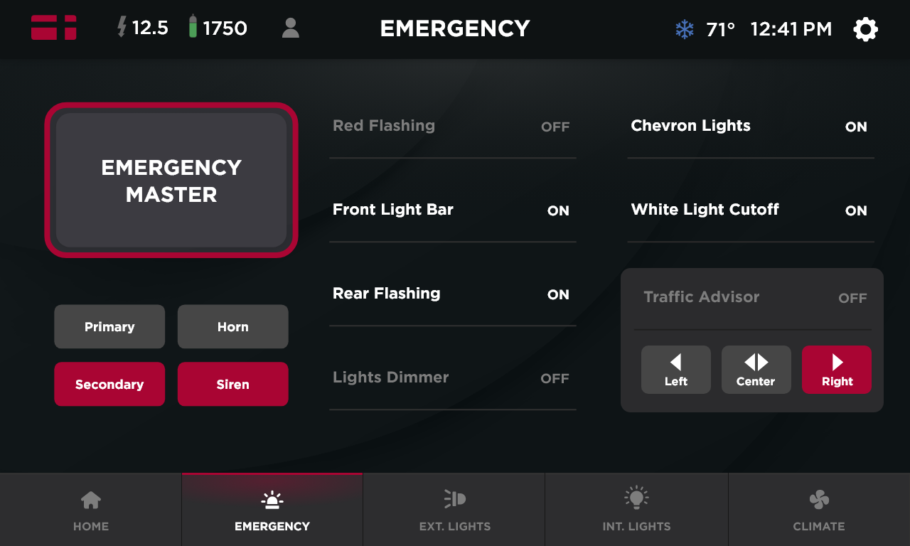
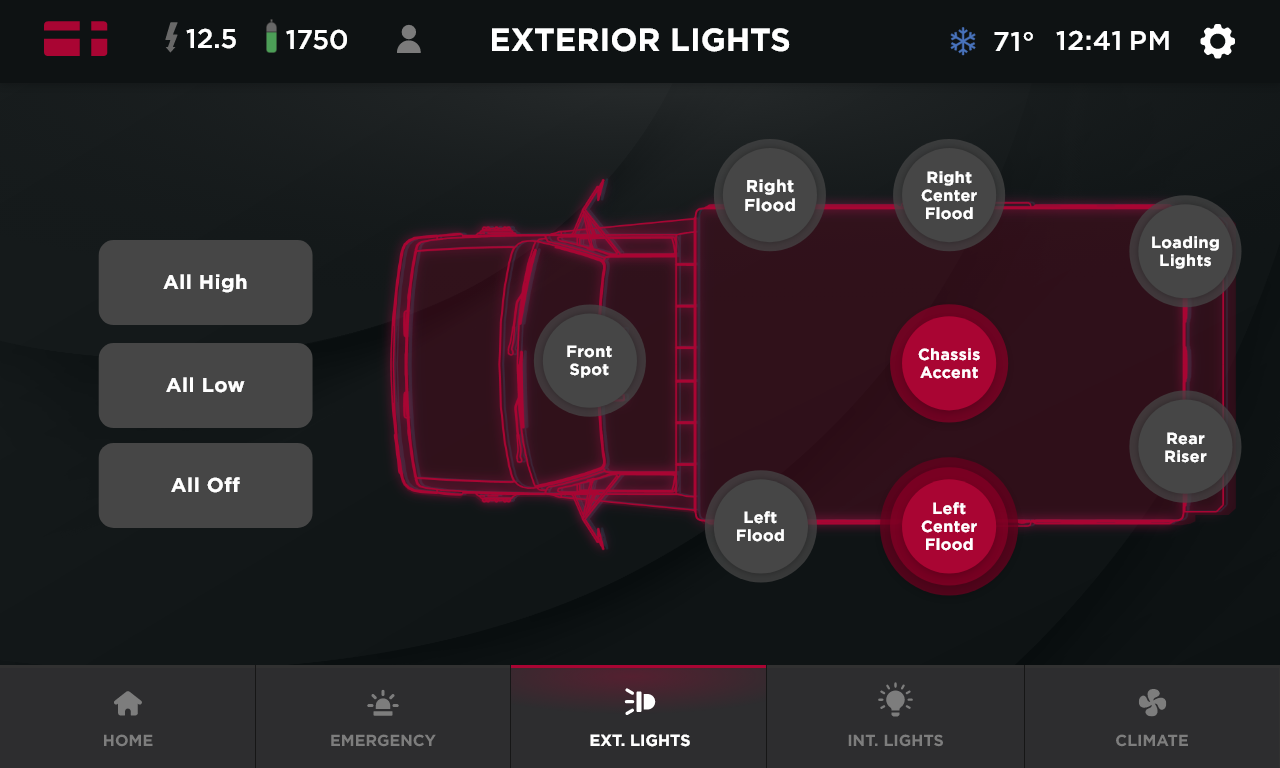
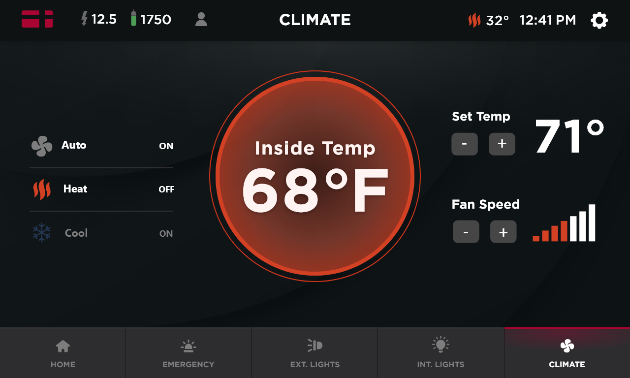
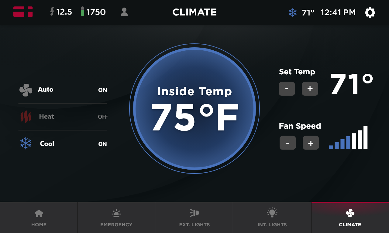
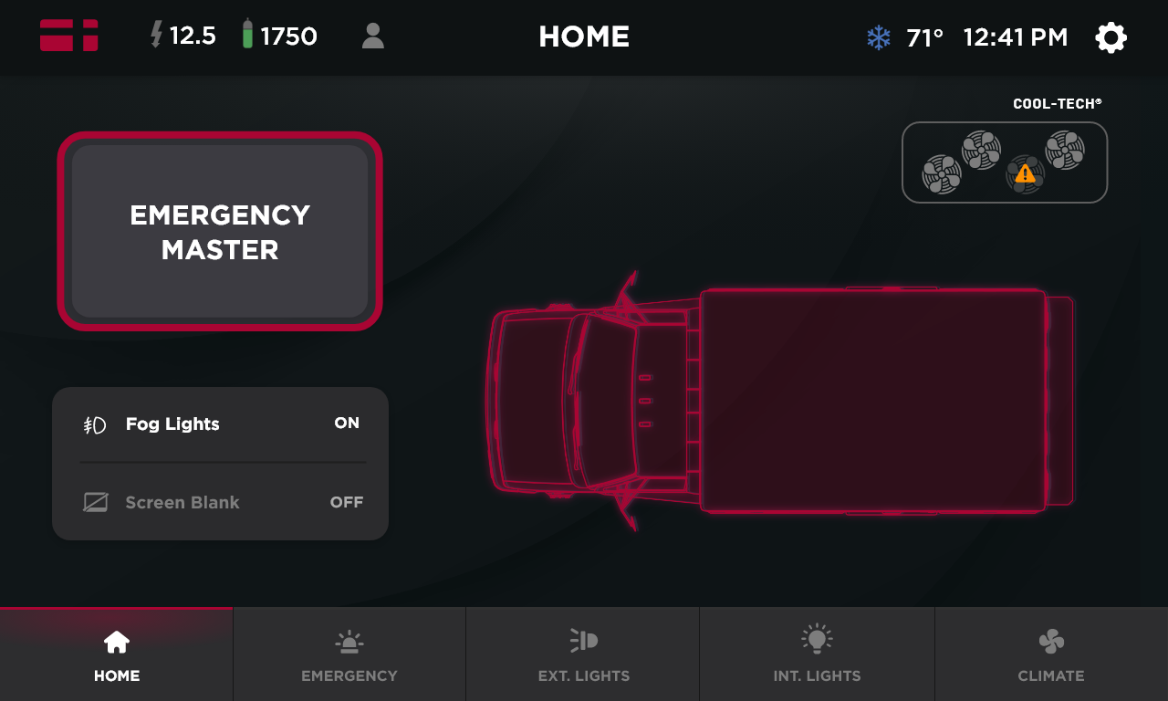
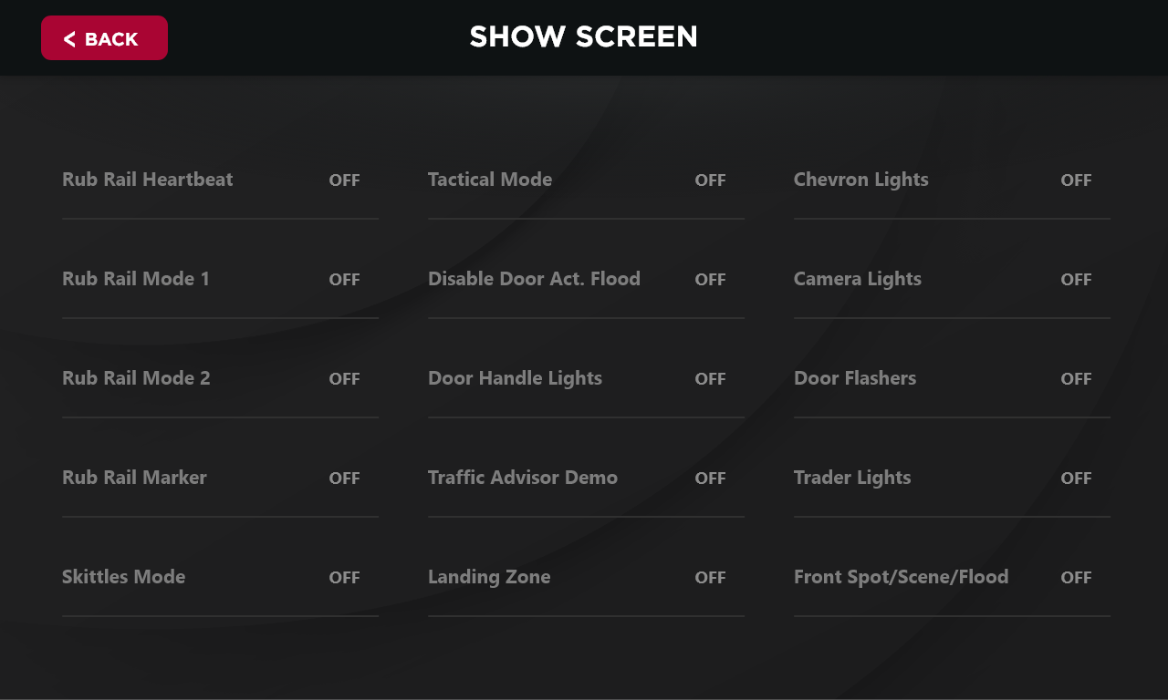
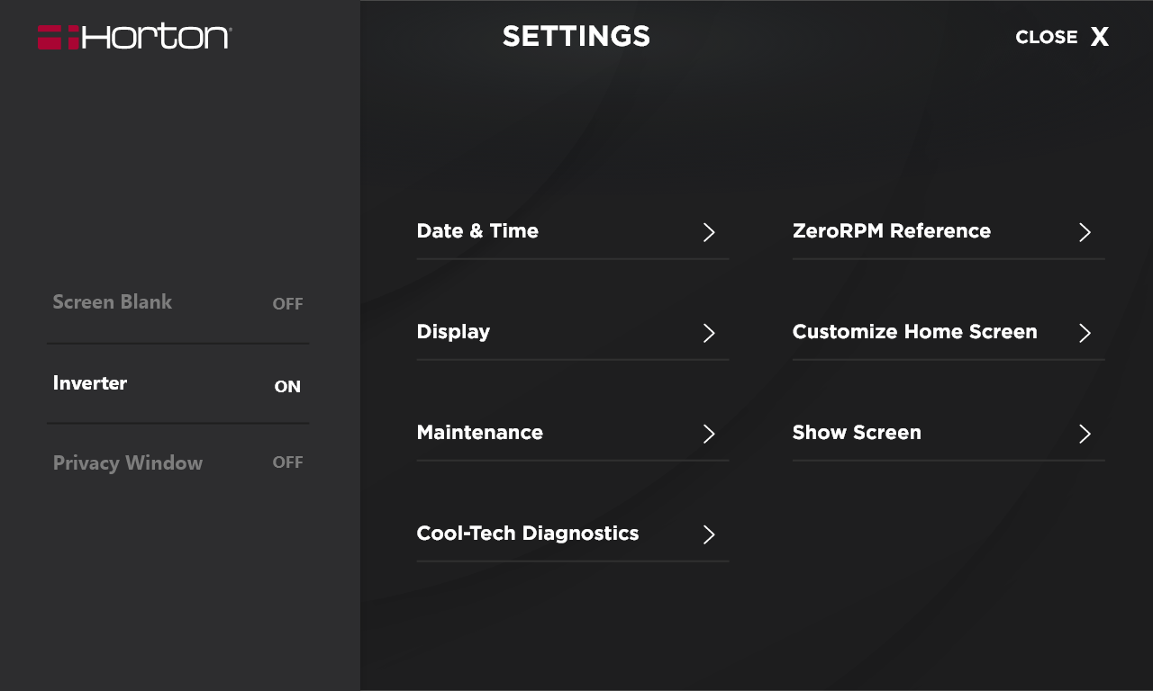
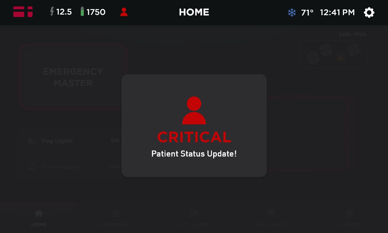
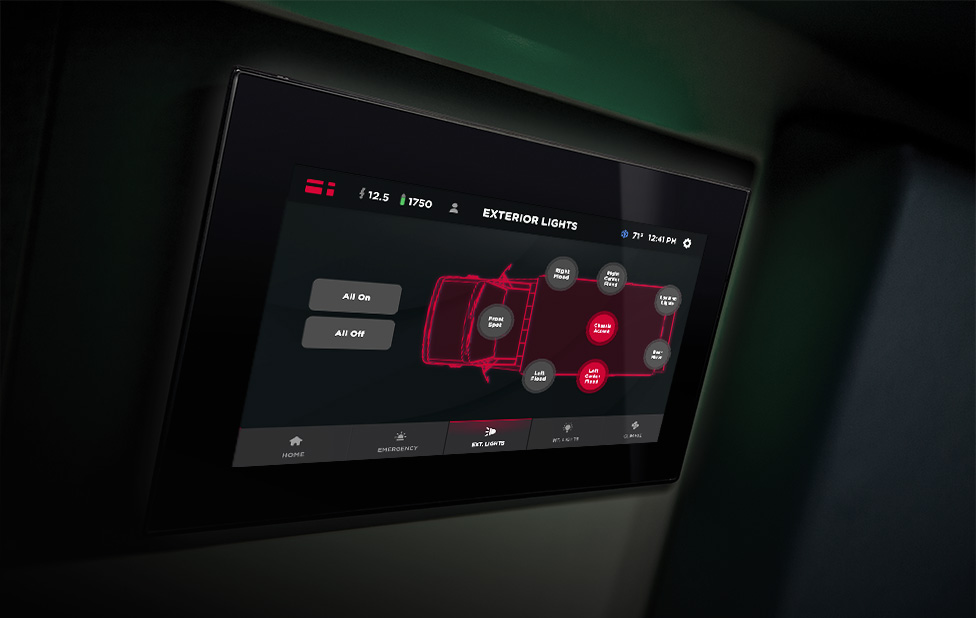
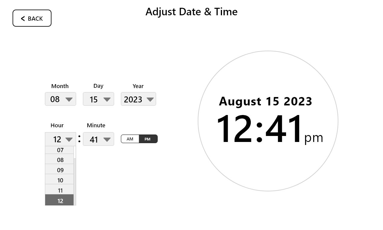
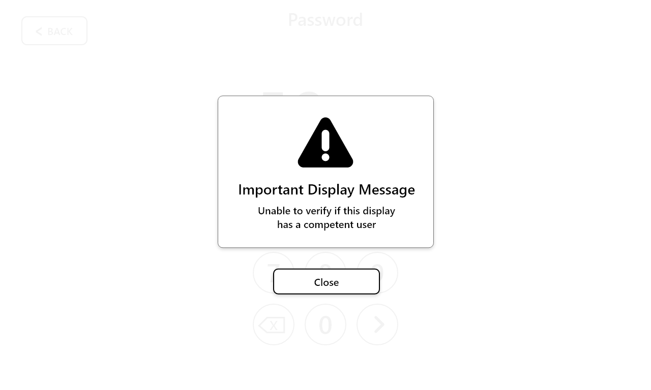
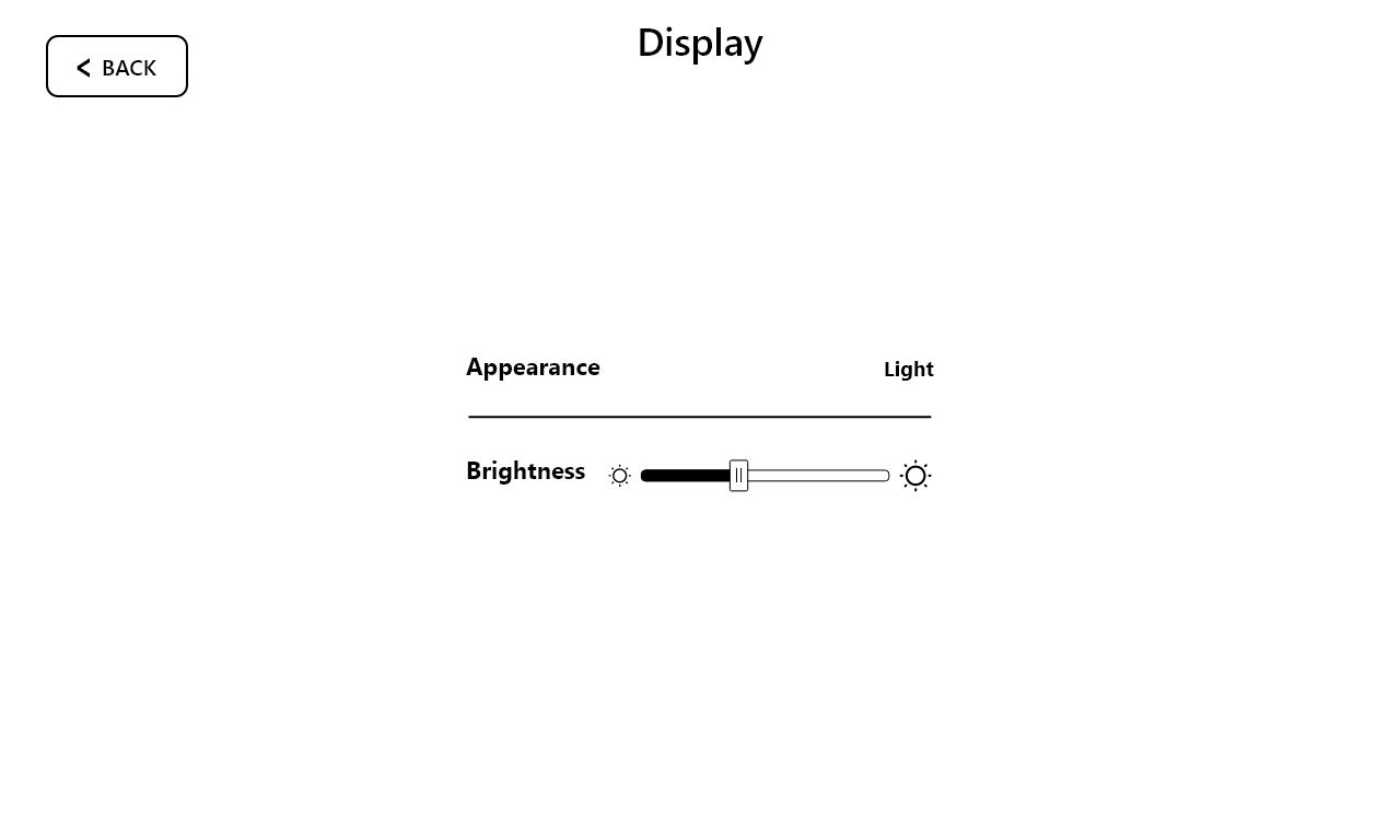
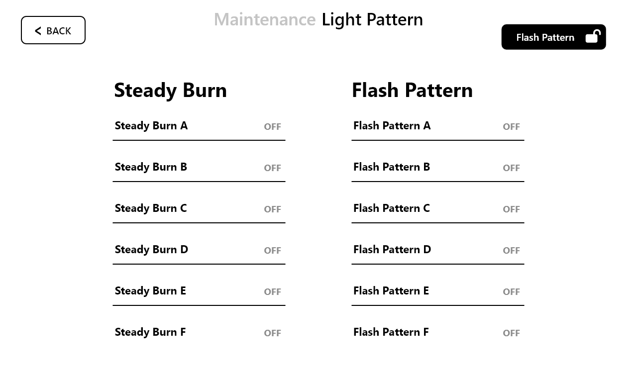
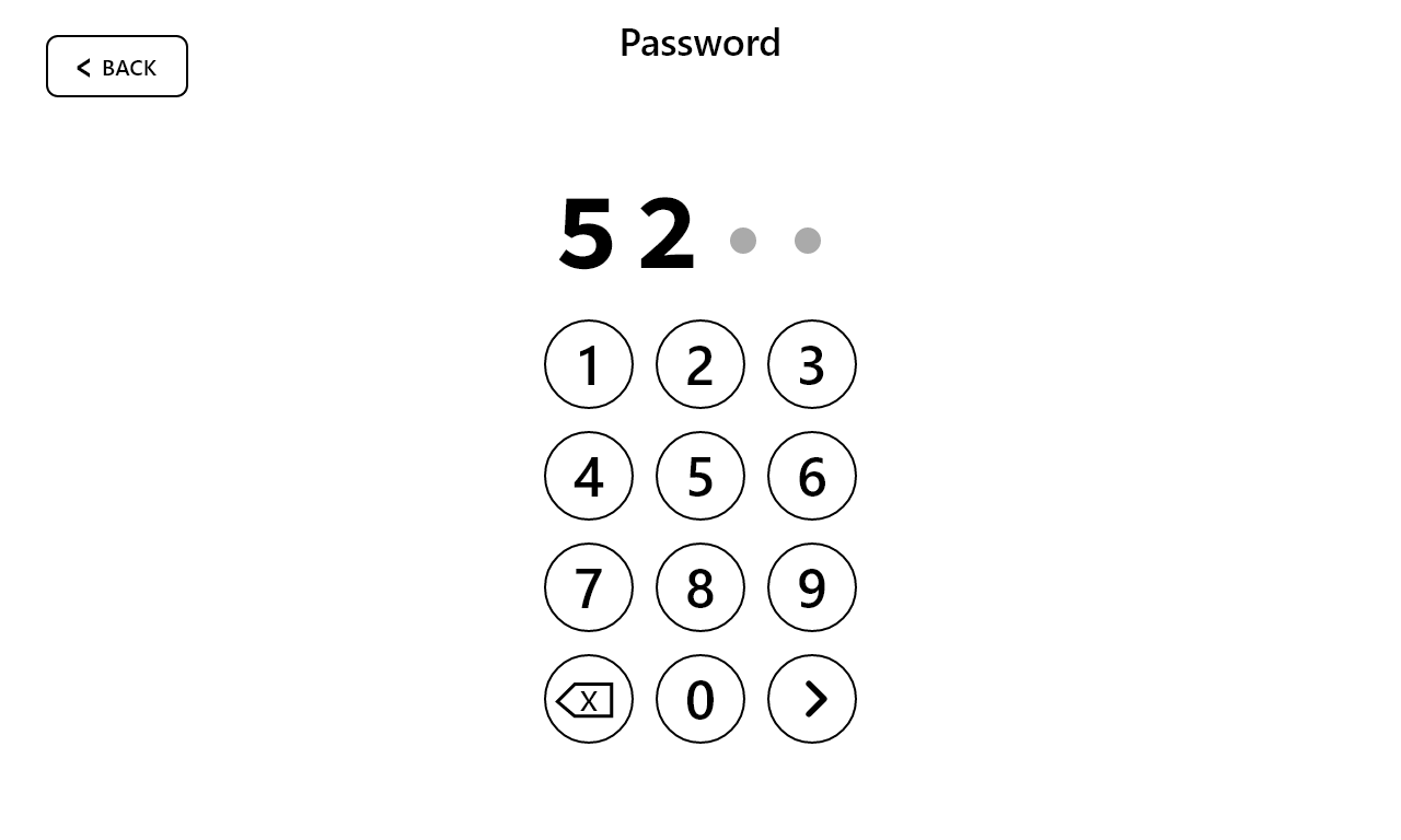
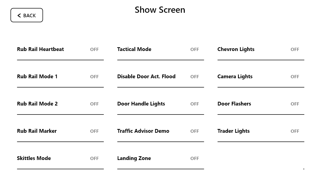
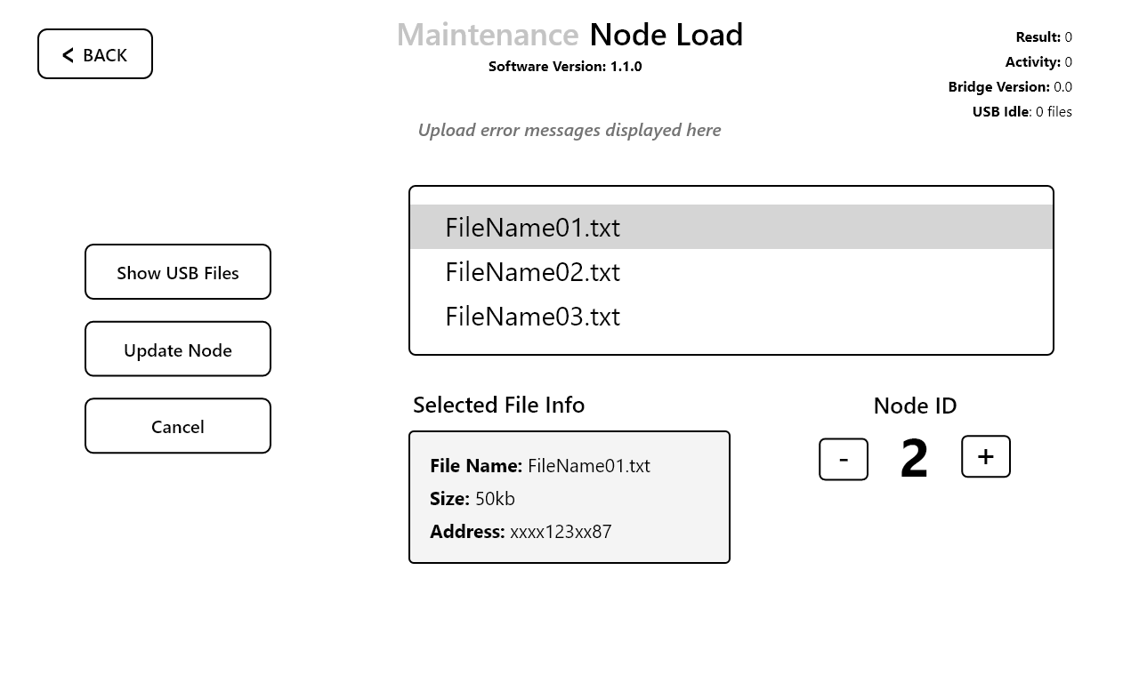
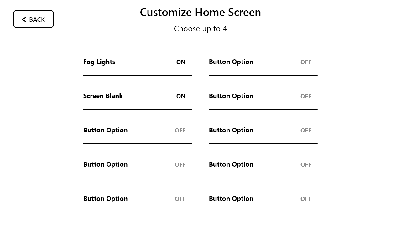
Using the mood board as a guide, I designed high-fidelity mockups that adhered to both the functional requirements and the visual style. Each screen was carefully crafted to ensure clarity, consistency, and accessibility. Throughout the process, I collaborated closely with stakeholders to refine the design, ensuring it met both user needs and the client’s vision.
To establish a cohesive visual direction, I created a detailed mood board that captured the desired aesthetic, including color palettes, typography, iconography, and visual patterns. The client wanted a modern yet approachable design, so I selected clean, professional elements that enhanced usability while maintaining a polished look.
Using the mood board as a guide, I designed high-fidelity mockups that adhered to both the functional requirements and the visual style. Each screen was carefully crafted to ensure clarity, consistency, and accessibility. Throughout the process, I collaborated closely with stakeholders to refine the design, ensuring it met both user needs and the client’s vision.